
Croissant Toggle Input
The Croissant Toggle Input is a button element that allows the user to opt in and out of Croissant. This component is used to opt in and out of Croissant.
Required Attributes
merchant-id
merchant-idplacement
placementOptional Attributes
Custom Text
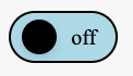
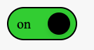
toggle-opt-in-text(string): defaults toon, changes the text that shows when the Toggle is in an opted in statetoggle-opt-out-text(string): defaults tooff, changes the text that shows when the Toggle is in an opted out state
Custom CSS
CSS classes and variables can be used to customize the look and branding for the Opt-In Container.
Use caution when changing toggle height and widthChanging the toggle height and width from the default (62px W x 32px H) can have unintended consequences. Slider width/height, calculations for slider position, and label font size and padding will likely need to be adjusted to accommodate the shift in dimensions.
Use the below sample CSS as a guide for what classes you can use to modify toggle proportions.
Example
   <croissant-toggle-input
          merchant-id="12345678"
          placement="pdp"
    ></croissant-toggle-input>
:root {
--croissant-font-family--main: "Times New Roman", serif;
--croissant-color--primary: limegreen;
}
.croissant-toggle-input {
width: 50px;
min-width: 50px;
height: 24px;
border: 1px solid black;
}
.croissant-toggle-input--opted-out {
background-color: lightblue;
}
.croissant-toggle-input__slider {
width: 16px;
height: 16px;
background-color: black;
}
.croissant-toggle-input--opted-out .croissant-toggle-input__slider {
left: 5px;
}
.croissant-toggle-input--opted-in .croissant-toggle-input__slider {
left: calc(100% - 20px);
}
.croissant-toggle-input__label {
color: black;
font-size: 10px;
}
.croissant-buyback-value {
font-family: var(--croissant-font-family--main);
font-size: 18px;
color: black;
}
Updated about 1 year ago
Did this page help you?