
Croissant Modal Button
This component is a button that opens the Croissant Information Modal. It will present as an un-styled line of text, which can be customized to match your UI.
Required Attributes
text
textType: string
Type: stringThis will set the button's label.
Example
<croissant-modal-button text="Learn More"></croissant-modal-button>Optional Attributes
payout-method
payout-methodcustom-modal-styles
custom-modal-stylescustom-modal-content
custom-modal-contentCustomization
custom-styles
custom-stylesThis attribute can be used to customize the look of the Croissant Modal Button text. You can customize select CSS properties via a JSON object. For an overview of the properties and types available, see below:
type CustomTextStylesPropTypes = {
  color?: string;
  fontFamily?: string;
  fontSize?: number;
  lineHeight?: number;
  letterSpacing?: number;
  textDecoration?: "underline" | "none";
};
Example
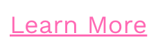
<croissant-modal-button text="Learn More"
	custom-text-styles="{
      color: 'hotpink',
      fontSize: 18,
      lineHeight: 14,
      letterSpacing: 0,
      textDecoration: 'underline'
    }"></croissant-modal-button>
const modalButtonStyles = {
color: "hotpink",
fontSize: 18,
lineHeight: 14,
letterSpacing: 0,
textDecoration: "underline",
};
const modalButton = document.querySelector("croissant-modal-button");
modalButton.setAttribute(
"custom-text-styles",
JSON.stringify(modalButtonStyles)
);Screennshot
Updated about 1 year ago
Did this page help you?